Optimising Car insurance renewals
Industry
Insurance Fintech
The team
Senior Product Designer (me), Senior Optimisation Manager, Senior Product Manager
My role
I led design across the discovery and design activities including:
- Critically evaluating the existing experience
- Creating wireframes of a potential new flow based on usability best practices
- Quickly tested proposed flows using UserZoom
- Created pixel perfect designs in Figma for developer handover
User Impact
- More modern experience - A bit part of this project was giving the product a face lift, and customers can now benefit from a cleaner, more modern mobile first UI.
- Fewer errors and confusion - We increased the visibility of tooltips, as well as bringing important information to the forefront to reduce the feeling of confusion for customers.
Business Impact
- Increased conversion - After launch, we ran the two versions in an A/B test and saw a 5% uplift for the variant, meaning more customers were viewing their Autocheck results.
- Increased revenue -This 5% uplift is estimated by the finance team as being worth ~£3.7m of additional annual revenue.
The Challenge
Car insurance renewals are one of Compare the Market’s biggest revenue drivers, with over 1m users enrolled in Autochecks each year.
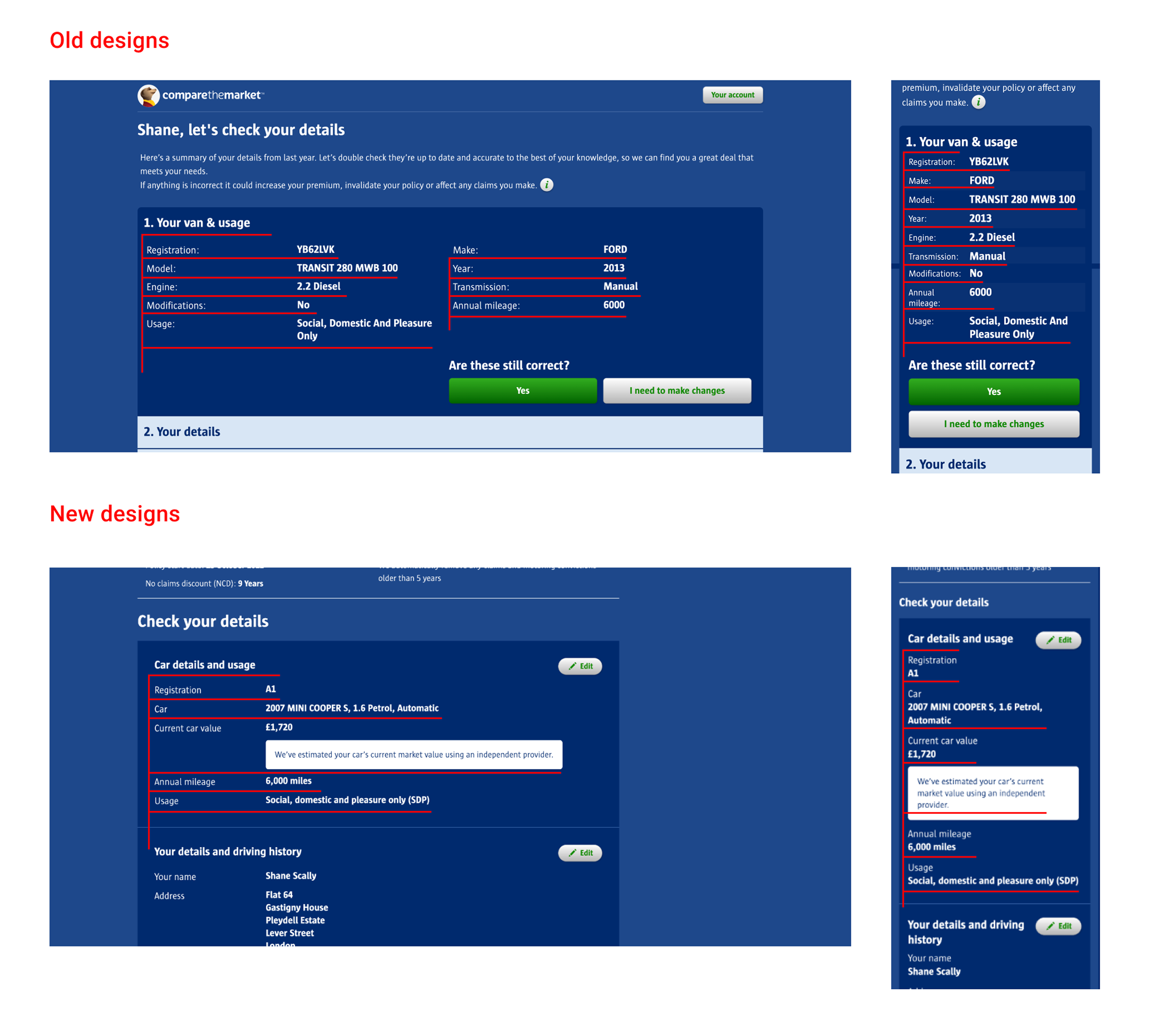
Users receive an updated quote, then must review their details on a summary page before seeing prices.
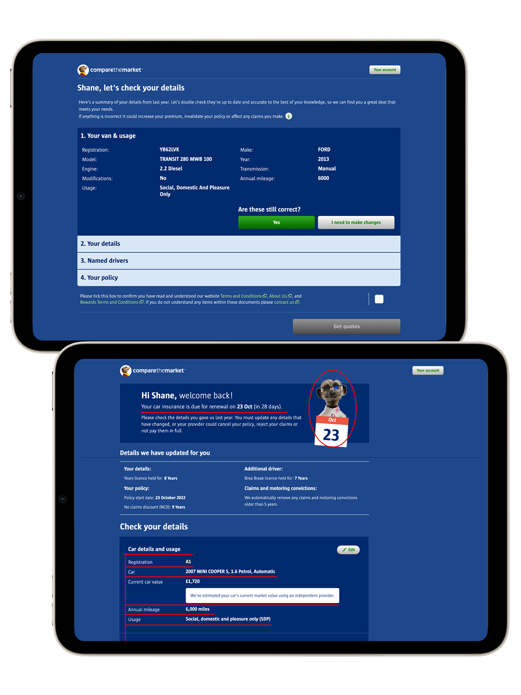
The old design created friction:
- Key updates were buried inside accordion menus
- The disabled “Get quotes” CTA confused users
- On desktop, information was spread across irregular columns, making it hard to scan
- On mobile, expanding/collapsing sections caused users to lose context
We needed to increase confidence, reduce confusion, and improve conversion at this critical step.
Previous Autocheck Summary Layout
Design Approach
1. Clear & Consistent Header
To reassure users they were on the right path, I:
- Carried through wording and imagery from the quote card
- Added the policy start date with supporting visuals (e.g. Sergei + calendar)
- Built consistency between entry point → summary page
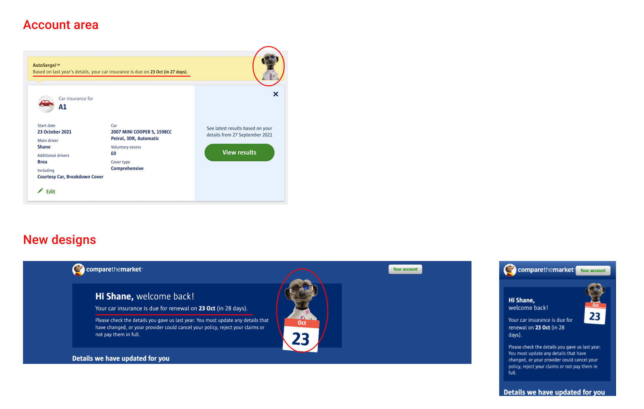
Consistency Between Account Area and Autocheck Summary
2. “Details We Updated for You”
Research showed users cared most about the auto-updated fields (e.g. licence years, no-claims bonus).
I introduced a dedicated section at the top of the page, clearly calling out what had been updated. This:
- Reduced anxiety about hidden changes
- Removed the need to scan tables to confirm updates
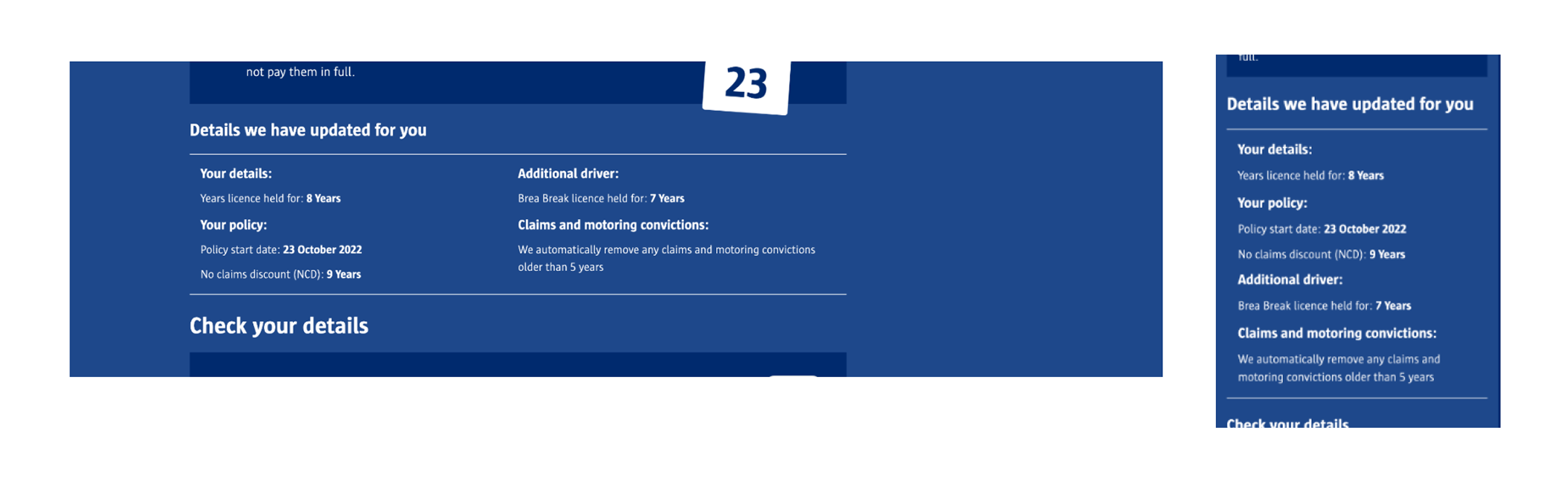
"Details we have updated for you" Section
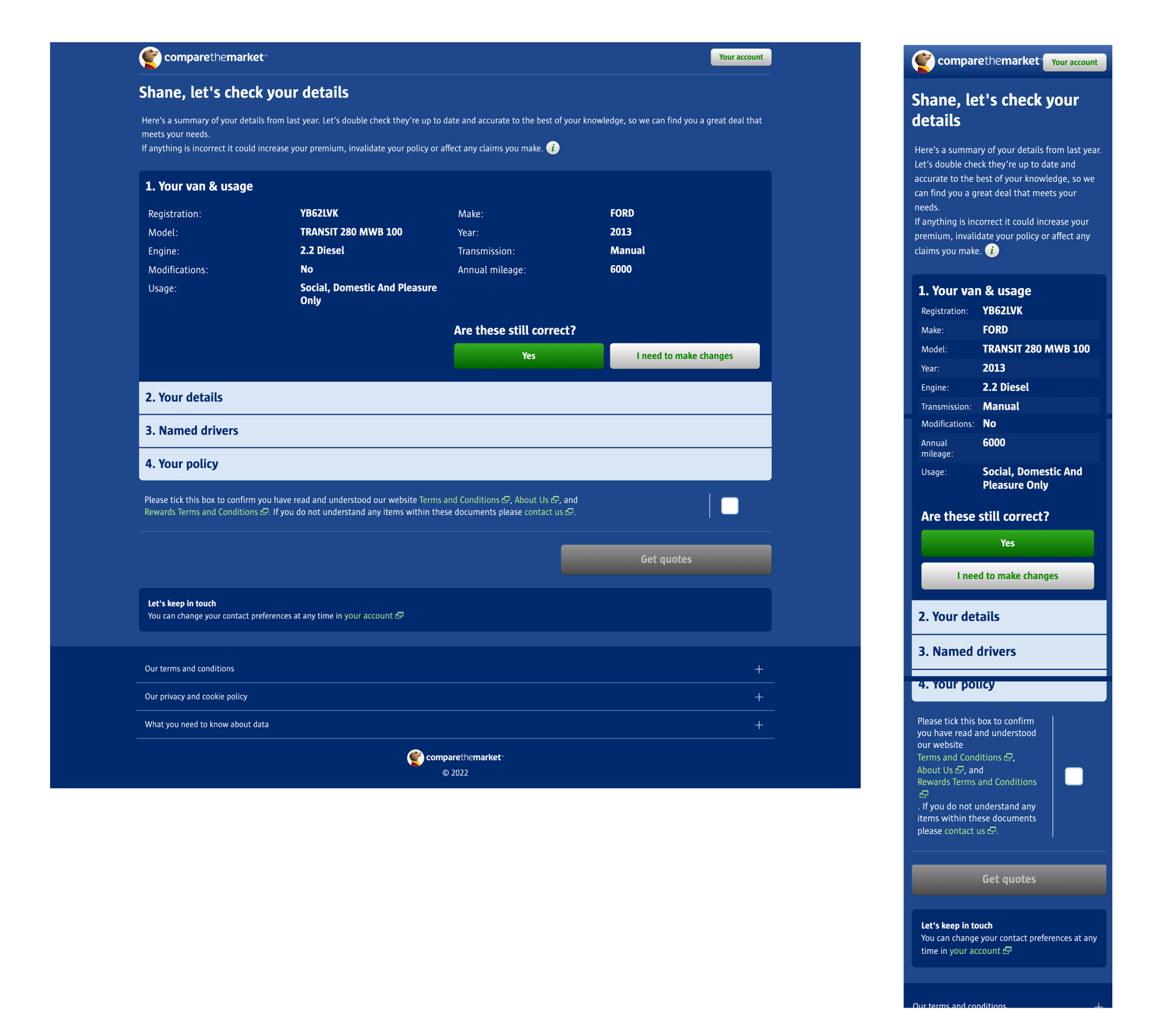
3. Linear Content Structure
To improve scannability, I:
- Removed the accordion pattern
- Laid out all details in a vertical, linear format
- Stacked questions + answers in a conventional F-pattern layout
On mobile, users could scroll seamlessly. On desktop, scanning was easier and less error-prone.
Change in Content Structure to Follow "F" Pattern
4. High-Contrast Highlight Boxes
Important renewal messages had been fading into the background in the old designs. To combat this I:
- Redesigned these with solid white backgrounds and higher contrast
- Gave updated fields clear prominence, making them easy to spot and edit if necessary
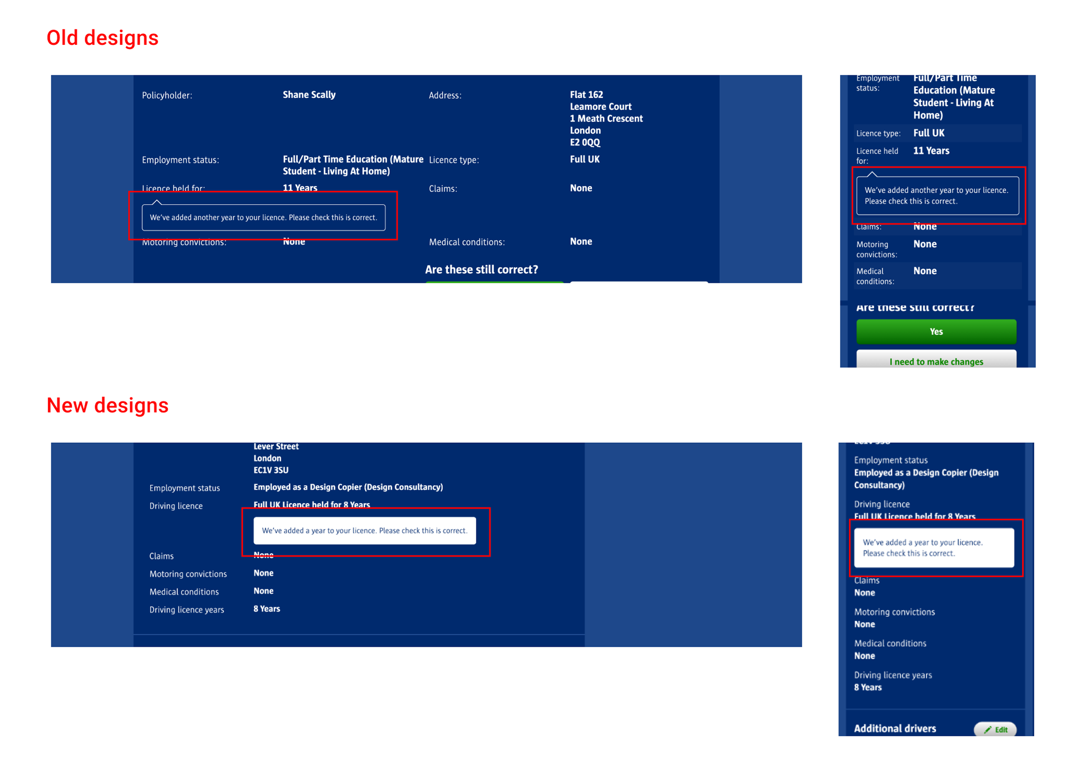
Differences Between Old and New Important Content Boxes
Business Impact
After the new designs were signed off by our commercial and compliance teams, they were launched on the website as an A/B test which ran over the course of 3 days, starting live to 1% of customers and eventually ramping up to 100% of Autocheck/renewal customers.
After the test reached significance, we observed a 5% increase in Summary Page to Provider Click Through for the variant which was estimated by the commercial finance team to be worth £3.7m in revenue p/a.
After its conclusion the winning variant was hardcoded and launched to all Autocheck and renewals customers on the website.
Other projects
Creating a culture of experimentation
How I helped to implement a culture of experimentation in a historically risk adverse B2B payments company.
See more
Building Payment products at Runa
Evolving Runa from a gift card network to a global payouts infrasctucture with the addition of flexible FIAT payment products.
See more